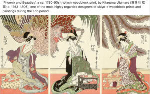
❖ Version History ❖
November 5th-8th, 2025
During this first week of November I received an email from Kirsten: “The bags are ready”. She goes on to describe that there are four of them made so far, and that they were already in the mail on their way to us.
I can already tell that the bags are going to be great just from the picture…. but I cannot wait to see them in person. In the weeks leading up to this part of the journey, we’ve been making a lot of aesthetic decisions about how the bags are going to be laid out, and I cannot wait to see all the results!
To go over some of the design decisions that were made, let’s talk about all the special features that are a part of today’s final product:
‘The ‘Top of the bag’
As you can see in the featured image above, there are a a good number of “parts” to the bag: the custom fabric walls, the accessories along the edge, and notably: the off-color, black roof.
Well, the top of the bag was an interesting decision, because we had the choice of making it anything we want… It didn’t even need to be a different color at all, it could have just remained a part of the rainbow pattern design. However, I felt that the super stark contrast from hyper-color to total anti-color was really going to make the bag pop… and when it arrived, I promise you we succeeded.
But the solid black material is not the only feature of the roof area. There’s also the pull-string that keeps the bag closed. Originally, I had thought that the string & top could be a sakura pink of sorts, since pink is unfortunately not a part of the game play… but once we decided on black for the top, I felt that the pull string should match the color of the roof, because any other color of string might look strange with the rest of the colors. And, this brings us to our next category of design:
‘The Metal Accessories’
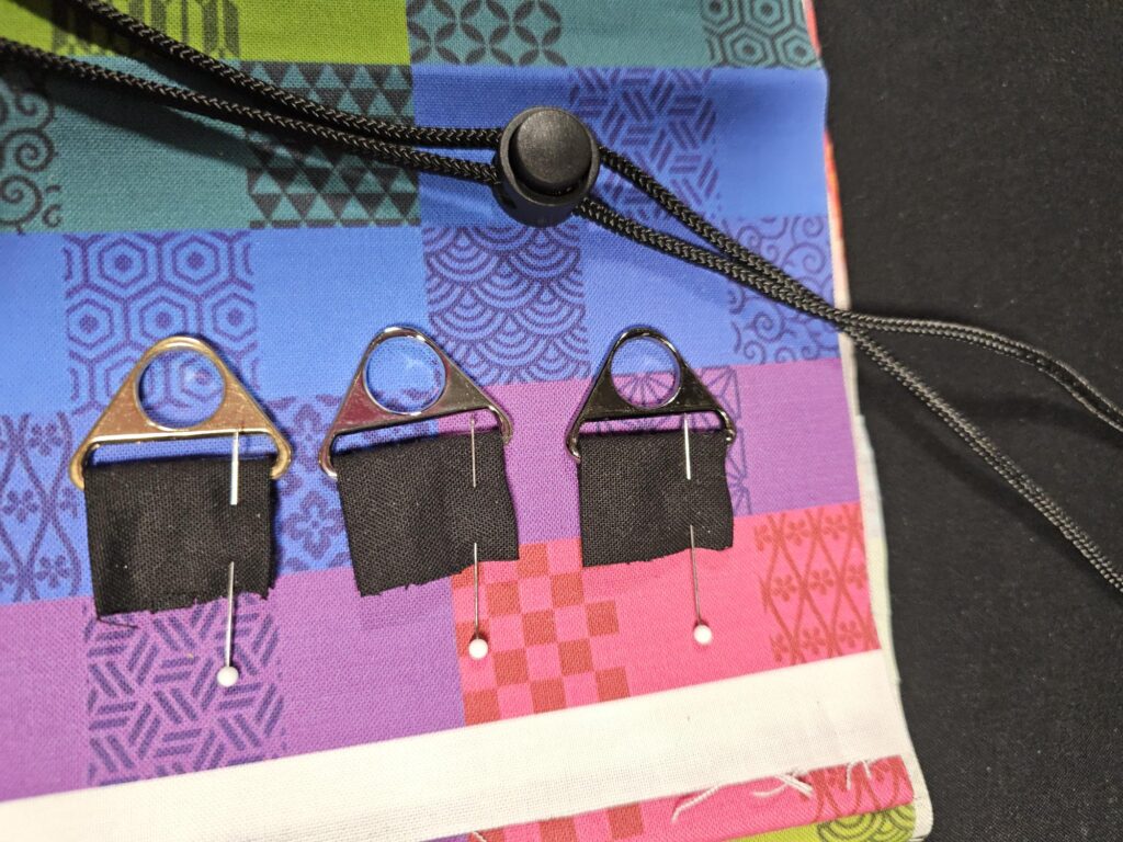
At the end of the pull-cord, there is a knot to keep it attached. But when the knot is exposed, it is easy for its job to fail over time, so it is customary to add something onto the cord to protect it. In our case, its a little metal bell. Additionally, the bags that Kirsten makes contain a clip l(pictured above in three colors). This item is for connecting the bag to other travel containers, like a backpack.
On this part of the journey, I was putting my faith in Kirsten to help make some decisions… but I also thought it might be nice to see the options & throw my 2-cents around on the final layouts. This is when we arrived at the picture you see above.
At first glance, I sincerely thought I might like the black metal the best, and the silver metal as a runner up… but the more I looked at them, the more I fell in love with the gold. I told Kirsten that I wanted to move forward with the gold metal layout for the prototype so that we could see if it was going to work or not. This leads into our next piece of the puzzle:


‘The Logo design & Tab”
This turned out to be one of my favorite moments in designing the bags. We had a lot of options on how to build out the tag to advertise our co-op project… but I loved the idea of this dual-tag.
Not only do you get both our company names in such a small area, but somehow it turns out that “Librarium Games” & “Legendary Wares” happen to have the exact same number of letters! This means that they look nice and similar (enough that you likely won’t notice at first!).
However, as you may have noticed right now, there’s two photos of the logos that look almost the same. This is true, but there’s a critical piece of information different within these pictures that absolutely had to be fixed before publication… can you find it?
It’s the pips within the head of our logo (the librarium logo). In the example image above on the right, you will notice that the dice has a 2-pip side & two 3-pips. This is a big issue, because it is supposed to be a very clear: 1,2,3, where the 1 is treated as the “eye” of the character, reading the book.
Ironically, I have no idea how this error took place, but luckily it was an easy fix!
… and with that the preparation decisions have been made, and wouldn’t you know it, the package has also arrived:
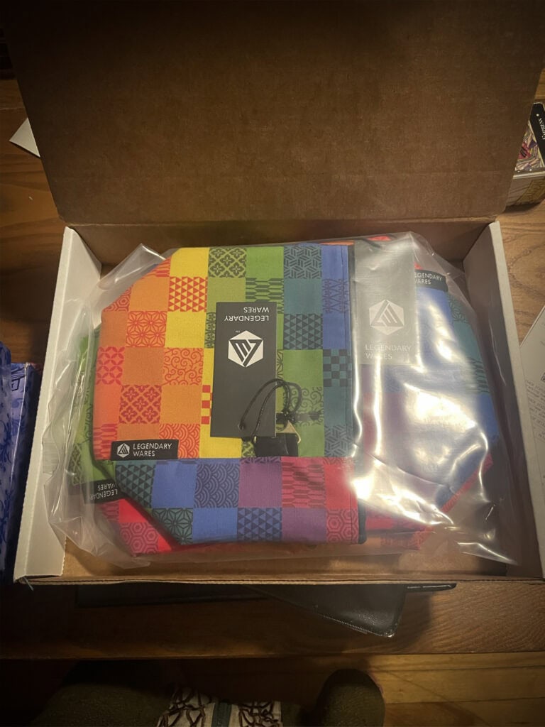
The bags are absolutely stunning. I took them out, and stared at them for hours on my shelf. I didn’t even remember to take any other pictures on this occasion because I was so distracted by how incredible each of them was, especially because by virtue of the way the pattern got designed for the fabric, there are going to be no two bags that are exactly the same. Each of them has a slightly different layout of the colors and the patterns, and I am in love.
I made sure to contact Kirsten immediately & relay this love. I don’t honestly think that I have ever done a more successful collaborative art project with anyone ever before. Our equal involvement and the stunning results are a treasure to behold. I cannot CANNOT wait to share these with you through the Kickstarter process. I am so proud!
Anyway, that will be the end of our tale today, because we have another huge thing showing up in the mail this week that I am really excited to talk about in our upcoming episodes of the Librarium Games Design Journal: our updated box designs for the final versions of Royal Threadcount! Stay tuned, and as always, thank you so very much for reading.